Consumer Web App: Plugging in the ideal user interface for your loyalty program
Our latest feature gives banks and fintech partners a ready-made customizable front-end for their loyalty program, both on mobile and desktop platforms

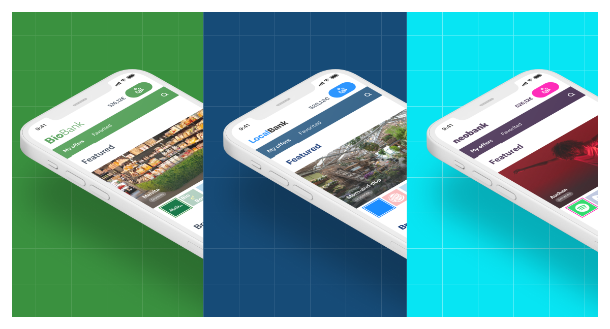
We developed our ALO® technology while keeping the user's experience firmly in mind from top to bottom, giving users a centralized end-to-end rewards experience without the bother of cookies or a constant barrage of ads. As a B2B company that provides this white-label solution, we expect our banking partners to make the most of our technology and craft their own personalized aesthetic and experience that engages users. However, we recognized that a ready-made Consumer Web App that can be plugged into banking apps and desktop browsers would bring rewards to bank clients faster and provide time-constrained partners with a best-in-class experience right out of the box.
Mobile-first approach
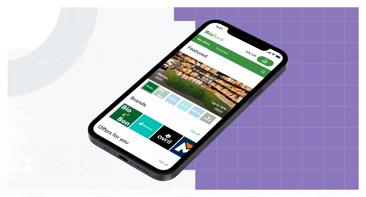
The be-all and end-all of every reward experience is mobile. This is where the vast majority of users will be onboarded and interact with your loyalty program. Ensuring that the process from onboarding to finally browsing detailed offers flows effortlessly will bring more rewards to your client base and more 5-star reviews from new app users.
Creating an intuitive user experience that guides users to the next step while browsing and fitting in all relevant information when necessary was the key design goal behind the consumer web app. Starting from the top, we highlight key menus and information such as total rewards earnings, offers, and favorited brands in the header that follows the user as they scroll.
While we are always intent on giving the user a varied selection, we are also conscious that too much information may drown the user and stray them away from clicking on an offer. This is why we looked to strike a balance between overall selection and personalized recommendations that gives the user a quality experience and saves them the trouble of scanning too many offers before finding something of interest. We’ve also included an expected search bar function, where users can quickly check for a particular retailer or offer.
Desktop ready
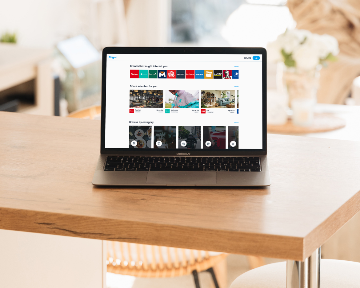
The same holds true for desktop users. We adapted the consumer web app for desktop users who prefer this alternative. The desktop view gives users the same great options and fluidity that keep them engaged and browsing offers.
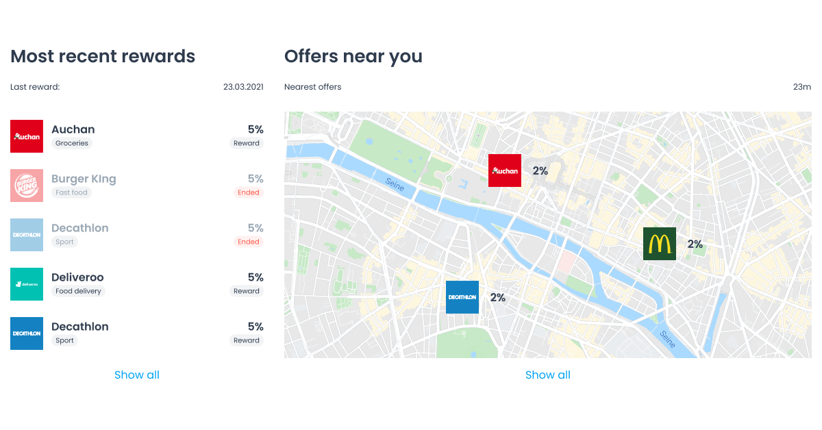
However, with the added screen real-estate, we could include more information on a single page, so users can stay engaged and see menus or categories such as their most recent rewards and offers near them in a single glance.
Presenting personalized offers that users genuinely want
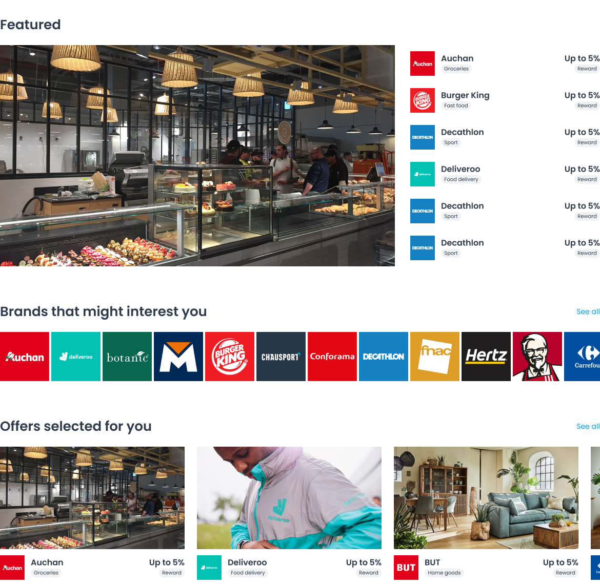
Building the ideal user experience means personalizing the program anywhere possible. Where this counts most is in the offers presented to the user. A critical section we built into the consumer web app is the "Brands that might interest you" or "Selected for you" section that tailors the experience for each user. These sections are powered by our Smart Ranking feature that suggests brands to users based on their purchase history. Smart Ranking is powered by our machine learning algorithm which is constantly analyzing user purchases to tailor a selection of offers for every user.
Having personalized navigation and smart ranked offers will bring the user one step closer to clicking on the ad to read the detailed offer. Getting to the detailed offer is the key to generating a higher conversion rate as users who ride the momentum and reach this stage convert eight times more when they click on the initial ad to see more detailed information.
Guiding users to offers with custom categories
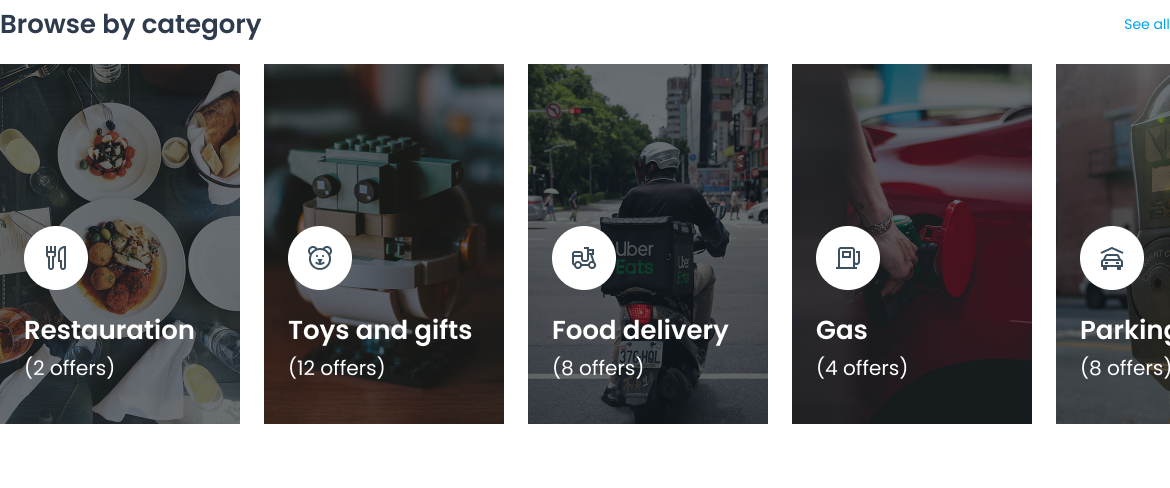
The consumer web app gives every program the ability to create as many categories as they wish, so clients can pinpoint rewards without having to scroll endlessly. Programs should be analyzing their users purchasing behaviors and tailoring the categories according to this precious data. We emphasize the importance of categories as it avoids creating a never-ending list of offers that your clients will have to scroll through before finding a reward that catches their attention. Going that one step further and ensuring an abundance of relevant filters allows users to see exactly what interests them faster. With PayLead Shift, our loyalty program management platform, program managers can identify insights that can guide the creation of relevant editorial content.
Our web app also comes with a "Near you" section that shows users where they can stop by within a 20 km radius to earn rewards. For programs that are giving a spotlight to small businesses, the near you map allows users to easily see pinpoint reward opportunities where users can physical purchases.
The added filters you decide to implement can be done by analyzing your users' transaction data and seeing where they spend. Regardless of whether you choose to include seasonal filters, sustainable options, or bio-organic friendly stores, the choices placed before the user must be tailored to their liking.
Making your built-in loyalty program
Integrating the loyalty program straight into the UX of your app is highly recommended. Avoid creating a different environment disconnected from the app or placing it in a hard-to-find spot within the navigation separated from the core experience.
In the case of a banking app, the best placement for a rewards account or access to offers would be on the home screen or next to a user's checking and savings, where users visit daily. This placement increases visits to the web app and brings the user one step closer to a personalized reward without searching within the application or using another website or mobile app to start browsing.
Continually iterating and seeking the best UX
The recommendations in this article push forward the current best practices we've implemented into our web app. However, your UX's evolution should never stagnate. Iterating and testing new features and experiences that will keep your members interested in earning rewards is a constant work in progress. Our team is dedicated to bringing the best to our program managers and presenting them with new ideas and methods to build user momentum. We will be working closely with banks and fintechs to continue crafting the best experience for their users.
If you would like to learn more about our consumer web app and how best practices can improve your UX design, contact the team or your account manager to schedule a call.